Related articles
Improve your back office indexes
As a project manager in a development company specialized in fintech (Hi CapSens), I saw lots and lots of back offices of web platforms.
These administration interfaces are very common and similar especially for indexes (resource lists): a large paginated table of 50 rows, a sidebar that contains the filter and a title. Always the same interface. This article explores ways to improve these simple interfaces. Being in a Ruby on Rails company, this article will show bits of Ruby code and focus on ActiveAdmin design but it can be applied to any other Admin index.
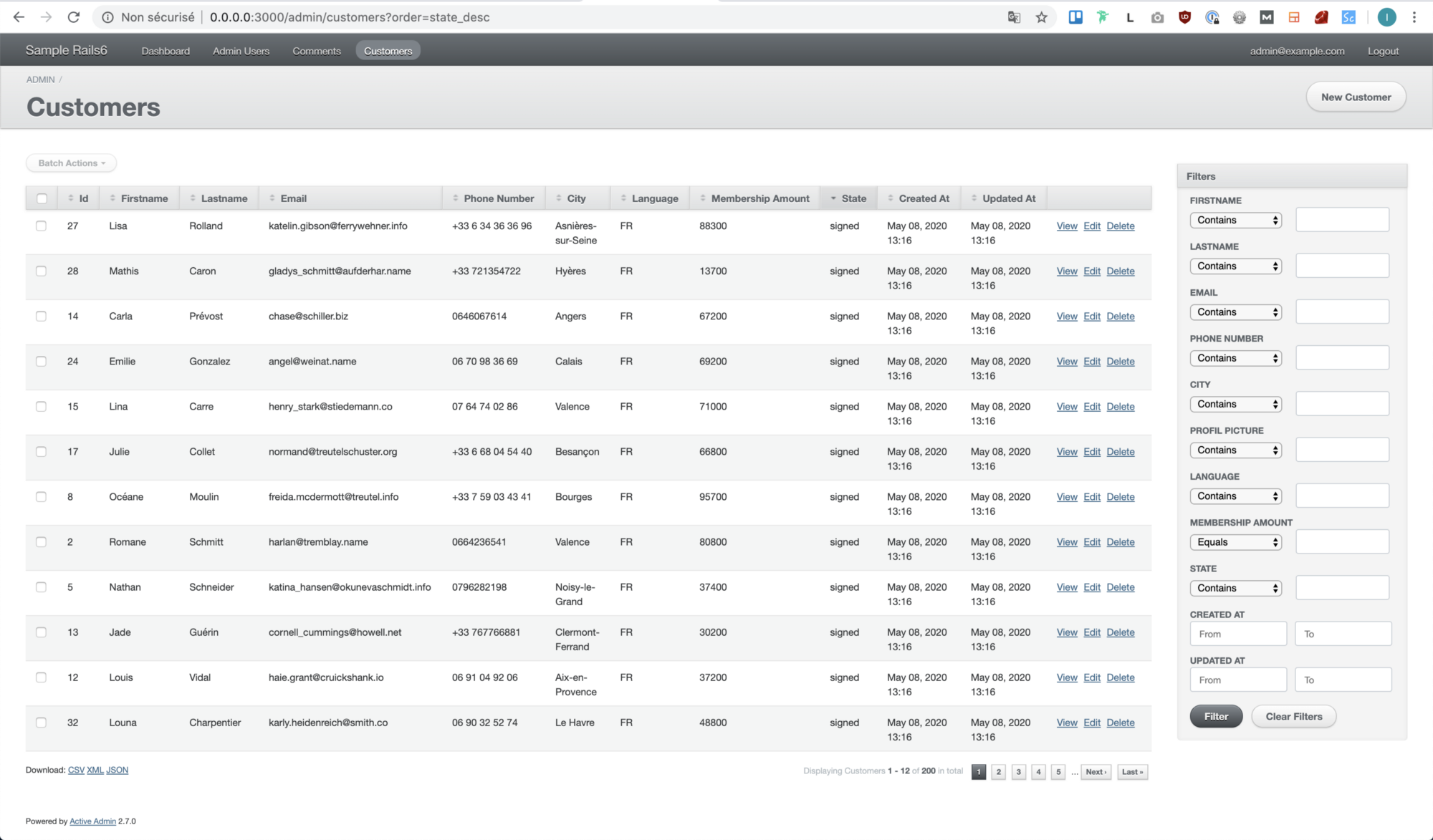
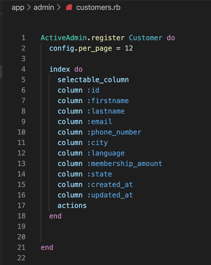
Here is a basic ActiveAdmin index. For the example, I created a customer template and an index displaying the fields shown on the right. The view is the AA generator's default, so we also have a bunch of useless filters stacked up in a sidebar on the right. You've already seen that, right? The code for this project can be found on this Github repository. There you will find a git branch representing each phase of this article (here “1_base_admin”).
Now that we're set up, let's move on and explore ways to improve our admin index.
Create a theme for your administration
There are several open source themes available for ActiveAdmin. Among all the quick wins I'm going to show you in this article, this one is perhaps the most important. First, we need to choose the theme we want in order to customize our administrator's interface. This wiki references a list of AA topics. By choosing your theme, you want it to be functional, you have enough bugs to manage, you don't want to add new ones thanks to your theme, right? A good indicator is to make sure that there are not too many open issues and that the theme is always kept up to date (check the latest commit on the master branch). Finally, if your project already contains a lot of AA pages, you should opt for light theming to avoid disruptive changes that you might miss.
Out of all the themes available on this wiki, my favorite is Artic Admin but for the reasons I gave you above, we are going to go for a lighter theme: ActiveMaterial. To implement it, simply follow the docs on the Github page, you should be ready in a minute (it only requires 3 lines of code to add).

The AA interface has changed and now looks different. With a bit of configuration, we can easily customize it further. The theme is made in SASS (SCSS) so we can search for variables and change the default configuration.
Customizing the theme
If we take a look at the color variables available, we can see that there are 14. To do this, add a new app/assets/stylesheets/active_admin/variables/_colors.scss file and require it in the active_admin.scss file before other files like this.
// Customization
@import ‘active_admin/variables/variables’;
@import ‘active_admin/variables/fonts’;
// Libraries
@import “active_admin/mixins”;
@import “active_material”;
Now let's go to our new _variables.scss file and change the theme a bit! First, we need to define our color palette. Since ActiveMaterial is a material design model, I used a material color palette generator for this. There are plenty of them available on the web, but I especially like Material.io.
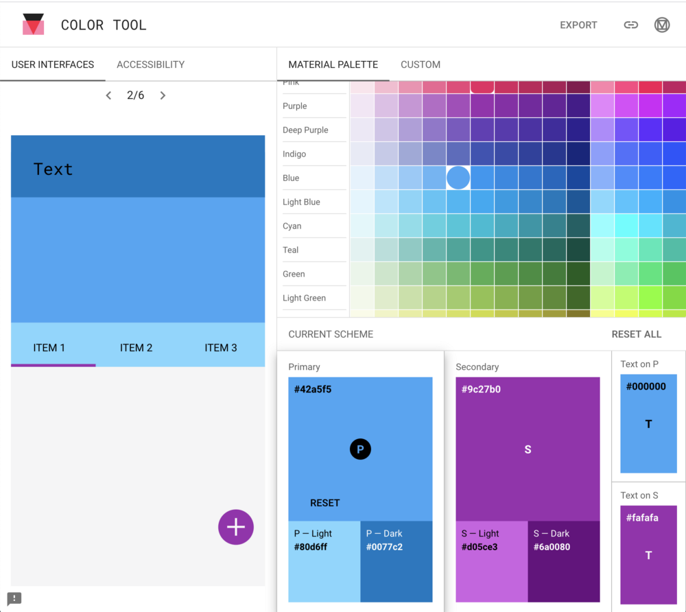
Once you have finished defining your model, simply transfer the value to our _variable.scss file by reassigning the value of the existing SASS variables:
$am-theme-primary: #42a5f5;
// A darker primary theme color for contrast when overlaying
// important items containers that are already treated
// with primary color.
$am-theme-primary-700: #0077c2;
//  Used for primary action button and components
$am-theme-accent: #673ab7;
// The background color of the document.
$am-theme-backdrop: #eeeeee;
// Background color of “paper” elements such as cards.
$am-theme-paper: #F5F5F6;
// Color used to separate elements such as table's lines
$am-theme-divider: darken($am-theme-backdrop, 2.5%);
You can find the code hither.
Of course, there are other options for further customization: fonts, elevations, sizes, breakpoints. To do this, simply repeat the same process as for the color.
Filter sidebar toggle

Now that we've added a few colors, we can see that our filter sidebar takes up 20% of the screen. That's a bit too much for a feature you won't use all the time, isn't it? Let's find a way to make it appear only when needed.
While looking for a solution to this problem, I came across This article by Emanuele Tozzato which shows a simple way to deal with the problem. With a bit of Jquery and CSS, it allows you to activate and deactivate the filter sidebar using an action element.

We're just going to push his approach a bit further because I'm not a big fan of adding an action element. These should be used for administrators' CRUD actions. So I modified the code a bit to move the filter toggle button to the top right of the index table.

If you are interested you can find The code here.
Add bands
Sometimes it can be complex for an administrator to distinguish items from one line to the next. One solution is to strip the picture clean. To do this, simply create a new scss component:
// app/assets/active_admin/components/_tables.scss
$table-striping-color: $am-theme-paper;
.index_content table {
  tr.odd {
    background: $table-striping-color;
  }
  tr.even {
    background: lighten($table-striping-color, 10%);
  }
}
For the color of the stripes, I used the value of our $am-theme-paper (the background color for components such as cards or tables) and just darkened the even columns. Easy, no? You can find The full code here.

Decorate your data
Sometimes you may find columns in your indexes that have no interest in being separated. For example the first and last name or each part of an address. You can then quickly merge them into a new “name” or “full address” column.
Additionally, when displaying an amount, you can add currency and number formatting to make it easier to read.
You can use a decorator like Draper for that. This avoids overloading the administrative logic.
__# app/decorators/customer_decorator.rb__
class CustomerDecorator < Draper::Decorator
delegate_all
  def name
    “#{firstname&.capitalize} #{lastname&.upcase}”
  end
  def membership_amount_in_dollars
    h.number_to_currency(membership_amount, locale: :en)
  end
end
Then, for each decorated column used, remember to specify how the sorting should behave like this:
# app/admin/customers.rb
ActiveAdmin.register Customer do
  decorate_with CustomerDecorator
  index do
    selectable_column
    column :id
    column :name, sortable: :lastname
    column :email
    column :phone_number
    column :city
    column :language
    column :membership_amount_in_dollars, sortable: :membership_amount
    column :state
    column :created_at
    column :updated_at
    actions
  end
end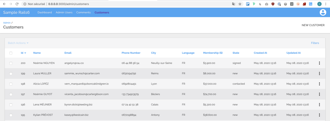
Improve the status display
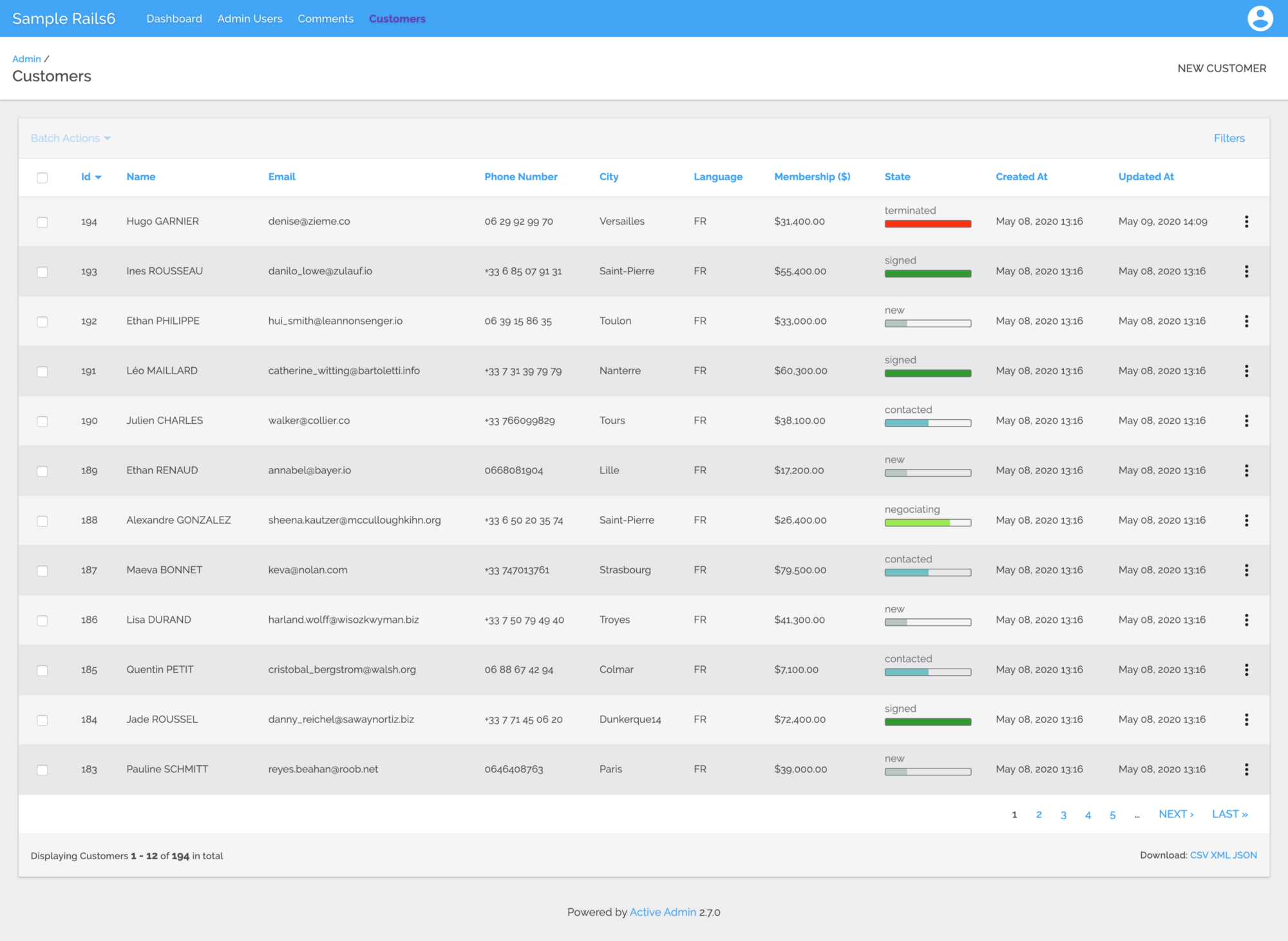
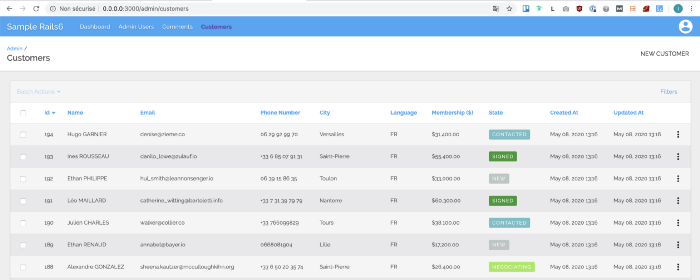
Resources displayed in an administrative index are often accompanied by a status. In our customer index, this is a core sales pipeline. Indeed, a customer is first in the “new” state before being contacted, then he can enter the negotiation phase and finally he becomes signed. He can then move on to the termination phase (when he cancels the contract).
Status labels
Of course, we can add a bit of color using ActiveAdmin's very simple status_tag function. First, we're adding status_tag logic to the index view of our AA customers:
# app/admin/customers.rb
ActiveAdmin.register Customer do
  decorate_with CustomerDecorator
  index do
    # [... others columns]
    column :state do |customer|
      status_tag customer.state
    end
    # [... others columns]
  end
end
We can then use a SASS “map” to customize the background color of the status_tag:
// app/assets/stylesheets/active_admin/components/_status_tags.scss
$customers_states_colors: (
  new:         #BBC6C3,
  contacted:   #70C0C6,
  negociating: #9DEA4F,
  signed:      #329932,
  terminated:  #FF320E
);
.status_tag {
  @each $state, $color in $customers_states_colors {
    &.#{$state} {
      background: $color;
    }
  }
}
Convert labels to progress
The result is more visual, but on the other hand, the states of our customers are linear, which means that for each customer, their first state will be: newfangled and finally he will enter the phase Ended.
Note that I used an enum for this because these states don't need transitions or guards but you can get the same result with a state machine like AASM or Statesman.
One way to graphically represent this linearity is to display the status in a progress bar. When it is empty, it means that the customer is in the Nouvel condition and when it is full, it means that the customer is either signed or finished. We will also reuse the color schemes defined earlier to make everything more visual.
First, let's add a method in our client decorator that will return the completion status as a percentage for our progress bar:
class CustomerDecorator < Draper::Decorator
  delegate_all
  # [ other decorator logic here ... ]
  def state_completition_in_percent
    customer_state_index = Customer.state.values.index(state).to_f + 1
    return 100 if state == :terminated
    total_states_count_without_terminated_state = Customer.state.values.length - 1
    completion = customer_state_index / total_states_count_without_terminated_state
    (completion * 100).round(0)
  end
end
Next, we'll render a partial.html.erb in our customer.state column:
ActiveAdmin.register Customer do
  decorate_with CustomerDecorator

  index do
    [ other columns logic here ... ]
    column :state do |customer|
      render partial: 'admin/customers/material_progress_bar', locals: { customer: customer }
    end
    actions
  end
end
Now we can create our partial material_progress_bar :
<div class="progress-wrapper <%= customer.state %>">
  <span class="state"><%= customer.state %></span>
  <div class="progress">
    <div class="bar" style="width: <%= customer.state_completition_in_percent %>%"></div>
  </div>
</div>
Finally, a little bit of style (don't forget to require it in your application.scss file):
@import 'active_admin/variables/colors';

$customers_states_colors: (
  new:         #BBC6C3,
  contacted:   #70C0C6,
  negociating: #9DEA4F,
  signed:      #329932,
  terminated:  #FF320E
);

$progress-bar-bg: #acece6;
$state-text-color: #707675;
$progress-bar-border-color: $state-text-color;

.progress-wrapper {
  .progress {
    position: relative;
    height: 10px;
    display: block;
    width: 100%;
    min-width: 100px;
    background-color: $progress-bar-bg;
    border-radius: 2px;
    background-clip: padding-box;
    margin: 0.15rem 0 1rem 0;
    overflow: hidden;

    .bar {
      position: absolute;
      top: 0;
      bottom: 0;
      transition: width 1s expandWidth;
    }
  }

  @each $state, $color in $customers_states_colors {
    &.#{$state} {
      color: $state-text-color;

      .progress {
        border: 0.5px solid $progress-bar-border-color;
        background-color: transparent;

        .bar {
          background: $color;
        }
      }
    }
  }
}
view raw
And that's it! 🎉