Related articles
Fintech's Crumbs E01: Improving your bank transfer payment processes

In the financial technology sector, the user journey often involves processing bank payments. It can be recharging an e-wallet, making an investment or paying a bill.
When the amount is greater than €2,500, the preferred payment method is bank transfer.
This article looks at a basic case of a user journey involving payment by bank transfer (SEPA) and explores ways to improve it.
Note: This is the first article in a new series called Fintechs' Crumbs that explores the web journey of fintechs.
1. The use case
Let's take a random, imaginary fintech called SmartFintek. On SmartFintek, users can top up their e-wallets. The e-wallet is only used for large transactions and the only authorized payment method is the SEPA bank cable.

A basic page to “top up your electronic wallet” (web)
The reloading process is essentially as follows:
- The user connects to SmartFintek.
- The user goes to their wallet and chooses “Recharge”.
- The user receives an IBAN and a BIC linked to his electronic wallet.
- The user makes the payment at his bank.
- The user receives the money on their SmartFinteck e-wallet.
As we can see, this is a very basic user journey that you may have experienced or implemented for your users if you have a fintech. Now, we're going to look for accurate data on how end users are actually experiencing this journey.
There are two main questions we need to ask ourselves:
- What type of device is most used for this user journey?
- How does the user make the payment?
What type of device is most used for this user journey?

If we go to Google Analytics, here's what we can see about the distribution of our users' devices. At CapSens, we work with many fintechs and these statistics are representative of the sector: nearly 2 thirds on computers, 1 third on mobile and 5 to 7% on tablets.
Based on this graph, you could say, “Ok, we have our answer. Two-thirds of users will recharge on their desktop and the other third on their mobile.” Not quite.
The distribution above is an average for all visitors to the website and for all pages, including the home page and other content pages. If we want accurate data on the distribution of devices for the recharging process, we need to dig a bit deeper.

This chart now shows the distribution of device usage for pages that are accessible upon login (all pages embedded in /account for example). We clearly see that the desktop computer is now very dominant with almost 80% of total use and that mobile devices represent only less than 20% of total use, tablets on the other hand are almost insignificant with less than 4%. So we have a user journey that takes place mostly on desktop devices. Now let's focus on the payment itself.
How does the user make the payment?
To perform the bank transfer, our users have three options:
- Use their banking website => desktop
- Use their mobile banking application => mobile
- Use a vending machine
(yes, it exists) =>? ??
First, the answer to this question may depend on the age of our audience. Does Analytics provide this data? Yes, it does:

The chart above shows us the proportion of sessions by age group. We can see that visitors aged 25 to 34 represent over 30% of total sessions.
Um... that's good but not good enough. Let's see if we can dig a bit deeper with this data.
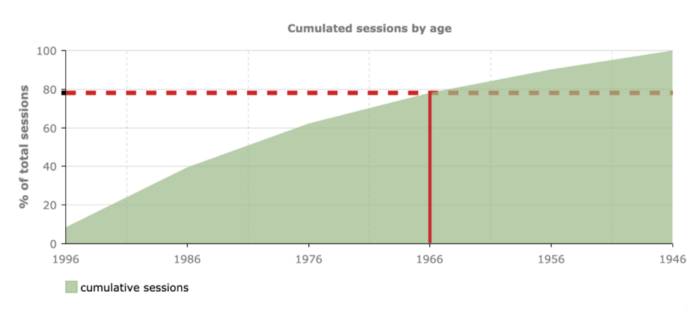
The graph above is cumulative, that is, it gives us the proportion of sessions that came from visitors who were born before a certain date.The red guide is there to highlight the fact that 80% of visitors were born before 1966.Based on this statistic, we can now search for data on the behavior of people under the age of 54: do they go to a vending machine, use their computer or their mobile banking application?
According to the fifth edition of the famous Deloitte study (one of the “Big Four”) “The French and the new financial services” :

As expected, there are only three ways to make a bank transfer, but the most used is the mobile banking app, which accounts for 43% of the total. Next comes the bank's website (35%) and lastly, but not surprisingly, the ATM or branch (17%) .Now let's see what this most common case induces for the user journey.
User journey with a mobile banking application created by bank transfer
As we saw earlier in this article, this user journey is the most common scenario:
- The user gets the bank details (IBAN and BIC) on his computer.
- The user uses their smartphone to add the new beneficiary (if it is the first time) and to start the bank transfer.
The user journey is not homogeneous; the user goes from desktop to mobile to make the bank transfer. So we have a break in the flow.

Based on this observation, we can now ask ourselves: how to make this user journey as easy as possible for the end user? Let's explore a few options.
Manually enter the IBAN and BIC
If you haven't taken any particular measures for the reload flow, that's what 43% of your users do. I did it several times: you read the IBAN and the BIC on your computer screen and you type each character one by one on your smartphone. An IBAN can have up to 34 characters. Hew!
Okay, we all survived that experience, but it's not what we can call good UX. Let's see if we can come up with a better solution.
Email contact details
To avoid the user having to manually enter the IBAN and BIC, a solution could be to send the contact details by email to the user so that they can copy and paste them into their mobile banking application.
Sounds ok, but not really that great. Receiving the email could be a problem. Transactional emails are often delayed, end up in the spam folder, or don't reach their destination at all.
EPC QR codes
These QR Codes can be used to initiate a SEPA transfer. They are defined by the European Payments Council. Basically, you receive a QR code and when you scan it with your mobile banking application, the bank transfer is created, you just need to check its beneficiary and its amount and in one click you have initiated the bank transfer in one click. Great, no? Unfortunately, there is a big problem: only a few European countries support it: Austria, Belgium, Finland, Germany, Germany, Netherlands. So unless your users are located in one of these countries, no EPC QR Codes for you!
Allow the user to access the page with their smartphone
Another solution could be to allow the user to access the page from their smartphone. The major disadvantage of this solution is authentication: the user could be reluctant to reproduce their journey on another terminal:
- Go to the site
- Log in
- Access your account then to the “recharge your wallet” page.
That's a lot of steps just to avoid having to manually type 45 characters (34 + 11). But can't we find a solution to make this faster? We have a user already connected to their computer and we have a smartphone. What can we do? A solution could be to set up a QR code containing a direct URL to this page. The user would only have to scan it with their smartphone camera and would be automatically redirected to the same page on their mobile.
Wait. What? Without authentication?
The page that is accessed with the QR code would only contain the IBAN and the BIC. Ce is not sensitive data. Don't you see them on every bill? In addition, the link could be secure by a token in order to ensure that this data cannot be consulted without knowing the token. Finally, the token could be strong enough for it to be hard to force it.Let's try to implement this feature.
1. The user can view a QR code by clicking on a “see this information on your mobile phone” link.
The link should not be displayed on tablets and mobiles otherwise it would be weird. In my solution, a click on the link displays a modal with QR Code but there are plenty of other solutions (tabs, collapsing content...).

2. The user receives the QR code
Here, the QR code is generated on the server side. To do this, there are numerous APIs available, such asGoogle Chart API (recently deprecated). For this article, I coded the website in Ruby on Rails, so I used a gem RQRcode which is very simple.
La gemstone allows you to choose whether the output should be a .png or an .svg. In my opinion, .svg allows a more accurate rendering (no pixelation) and is lighter than a png file. In addition to the options, it requires content that is here a link.

As far as this link is concerned, the process is fairly simple. Each user receives a unique token in the database. This token is added to the URL as a parameter (green color). When someone tries to access the page, we check if the token exists in our database, if so, we retrieve the wallet information and display it, otherwise we return a 404 Not Found error.
As you can see, the token is unbearable, which is why we never display it directly to the user. The URL containing the token can only be found by scanning the QR code.
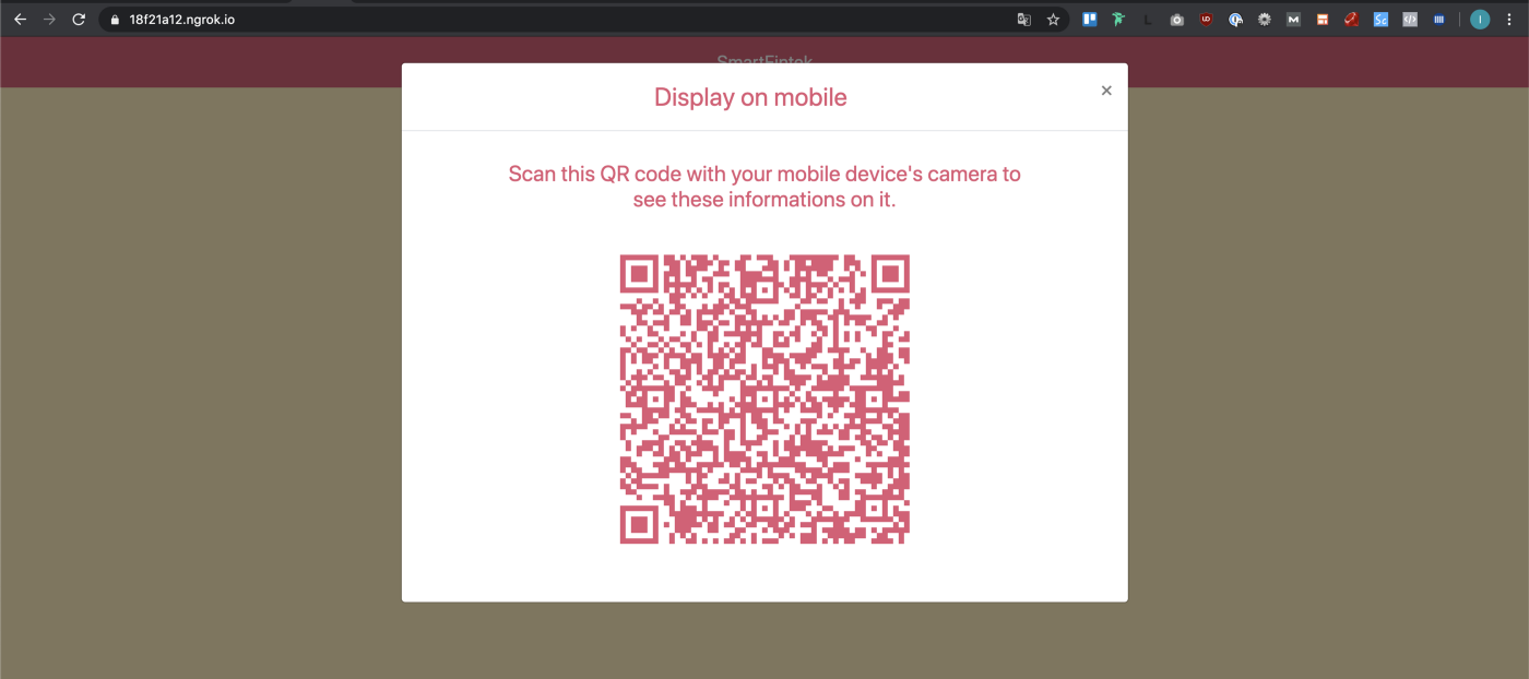
3. The user scans the QR code and is redirected to the same page on their mobile phone.
This feature improves the user journey for those who use a mobile banking application to make bank transfers (43% of our users). On the other hand, this does not help the 17% who physically go to an ATM or to the reception of their bank. An easy solution could be to implement a “send payment instruction by mail” button so that they can have bank details in their mailbox, ready to use whenever they need them. For the 35% who perform all operations on their computers, the process is already simple for them as there is a quick copy button for the IBAN and BIC.
And that's it. Do not hesitate to Give me feedback on how you handled this user journey (maybe you want to share a better solution that you found).