Related articles

Getting by with CSS

A bit of history here: I started coding a year and a half ago. I followed a 3-month bootcamp focused on Ruby on Rails with a bit of HTML, CSS (mostly using the Bootstrap framework), and JavaScript. Since then, I've been working on full-stack Ruby on Rails applications and if you don't know what that looks like, that means we're always writing full HTML pages as if it were a baby from 2006 (I know you're here) StimulusReflex, just kidding).
Since I didn't like CSS and HTML during the bootcamp, I didn't put a lot of stress on it and started working and really suffered. Honestly, I was a bit convinced that all this bunch of code made no sense (it was very presumptuous). Oh and I was always finding a roundabout (and ugly) way to make my page look the way I wanted and that's it!
But in the last few weeks, I finally decided to devote myself to it and improve myself. Along the way, I found so many great resources that I wish I had had right from the start. It's my journey to finally make peace with CSS and be thankful for all the people who write/record so many great things. And maybe you'll find my steps useful for you.
0. Wanting to improve in design
I gradually signed up for a bunch of newsletters on the user interface, I started reading articles on how to improve your design and I realized that there were subtle changes that could make your page look better.
I also went down the rabbit hole by subscribing to the newsletter of CodePen and seeing so many great pens written in pure CSS like the famous Moustached nanny, I wanted to join the party!
1. Start by understanding its history
HTML and CSS have existed for a long time and I discovered it while reading the article Old CSS, new CSS that what we're getting now is the result of a long history of development to master the layout of a page without too much fiddling around.
In my work, we've never needed to support older browsers, so that hasn't been a problem for me yet, but with this article, I've learned that this is one reason why CSS is considered difficult (who would have believed it?).
2. The selectors must be your sidekicks
To be able to apply CSS to your HTML, you need to know how to select the elements you want to style and there's a fun game for that: CSS Diner. You don't have to find everything the first time because some are quite complex and you probably won't need them for a long time, but yeah, Kawai !
Also, if your style doesn't seem to want to apply sometimes, it turns out that it's not stubborn, you're just not good enough specific. Because I didn't know that one day I submitted a pull request with a ! significant inside and it's the thing that will keep me awake in shame in twenty years.
3. Marie Kondo this shit: understanding the boxes and the display
It turns out that we can Put everything in a box.
Some items are inline, others are blocks and understanding which is which and what changes when you change the block view, inline-block or inline will help you control what's on your page.
Bonus:”box-sizing: border-box;“tells your block to take into account any borders or padding in the total width and height of your box, without adding them, as with the default behavior Content-box. Hence more reliable elements.
And speaking of filling...
4. Look the padding and the margin in the eye and don't be afraid.
(Blue is for content)
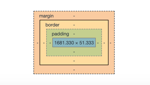
Did you know that the Margins are collapsing ? This means that if you have two items in a row with different margins, the bigger one will “win.” This is the end of my numerous attempts to increase spacing by adding margins on my two items. Here is the (very complete) article on spacing in CSS where I discovered it.
5. The lobotomized owl * + *
The owl selector * + * was invented by web designer Heydon Pickering. It is in some way linked to sections 2 and 4 so I thought it deserved to be presented separately.
It addresses an old problem: you have a list of the following items that you want to space out and you can't apply top-margin or bottom-margin to all of these elements because the first or the last element would have weird and useless spaces.
6. Stop thinking in pixels and think reactivity
I have to admit that Rem and em gave me a cold sweat and that I was relying on pixels to give me good old measurements. It turns out that's bad, basically if you want to code for the real web today, which means you have to deal with different screen sizes and your content has to adapt (all authentic discoveries along my journey).
7. Wait, are those variables in CSS?
Another thing that made me break out in a cold sweat was reading things like this:
:root {
--my-cool-background: #73a4f4;
}
Why would you do this to me? I don't understand the full power of it yet, but there's no reason to be afraid if you ever see one variable in your code base.
8. Relative and absolute positioning for victory
I think this Dev Ed video on the positioning in CSS is actually the first one I watched and followed to try to be less rubbish at CSS, so there's a sense of nostalgia that comes with it.
I am quite visual when it comes to learning and if you add cats, it's always more pleasant.
9. Stop dreading Flexbox and Grid
Oh my God. What if I told you that if you took the time to understand Flexbox, organizing the items on your page would be 100% easier? As promised, this is not false advertising.
I really liked it Flexbox Zombies because it keeps its promises: after following it to the end, Flexbox will become a reflex for you and you will no longer need to consult a cheat sheet before writing one. These are commands that may not be useful right away, but when you need them, you can come back to them.
I've always relied on Bootstrap on the various applications I've worked on so I haven't had to write my own grid system yet (you'll see in section 10 how it works in Bootstrap) but here's another kawai resource to see grid and flexbox alignment in action.
10. Bootstrap is not magic
It took me several attempts to read this article deconstructing the Bootstrap grid system, but it was definitely worth it. Bootstrap is a CSS framework whose grid system is based on a row containing columns. Understanding the math behind it all will take you a big step forward!
Whew! I think that's all for now!
I think I did my best by following the following principle:”Let's learn the basics and see if it can help“. Sorry for all the links, of course you don't have to read them all, they are there if you are interested in any of the things I wrote.
TEL; FROM: If you don't have time and you only want to read one thing, I highly recommend Design for Developers by Tania Rascia who will give you the first principles of design and layout with a step-by-step tutorial.
This article is not about the new bad boys/girls in the neighborhood (um um) that are transitions, animations..., because I haven't started learning them yet, so there will probably be follow-up articles!