Related articles

How to improve the style of your map with spacing
I started reading a lot of design articles and there was a principle that came up a lot: “White space” or “Negative space.” As said on Wikipedia :
It is the part of a page that is not marked: margins, gutters, and space between columns, character lines, charts, figures, or objects drawn or represented.
I am a bit of a visual person so I captured some examples of good/bad design and decided to code them. There are a few general rules, I will first show the results with a link to their codePen and at the end of this article I will highlight some codes that I found interesting while coding these cards.
A Few General Rules About Spacing
1) Feel free to use margins and padding.
Sometimes it's just to have a more enjoyable read.
Sometimes it is necessary to let your card breathe:
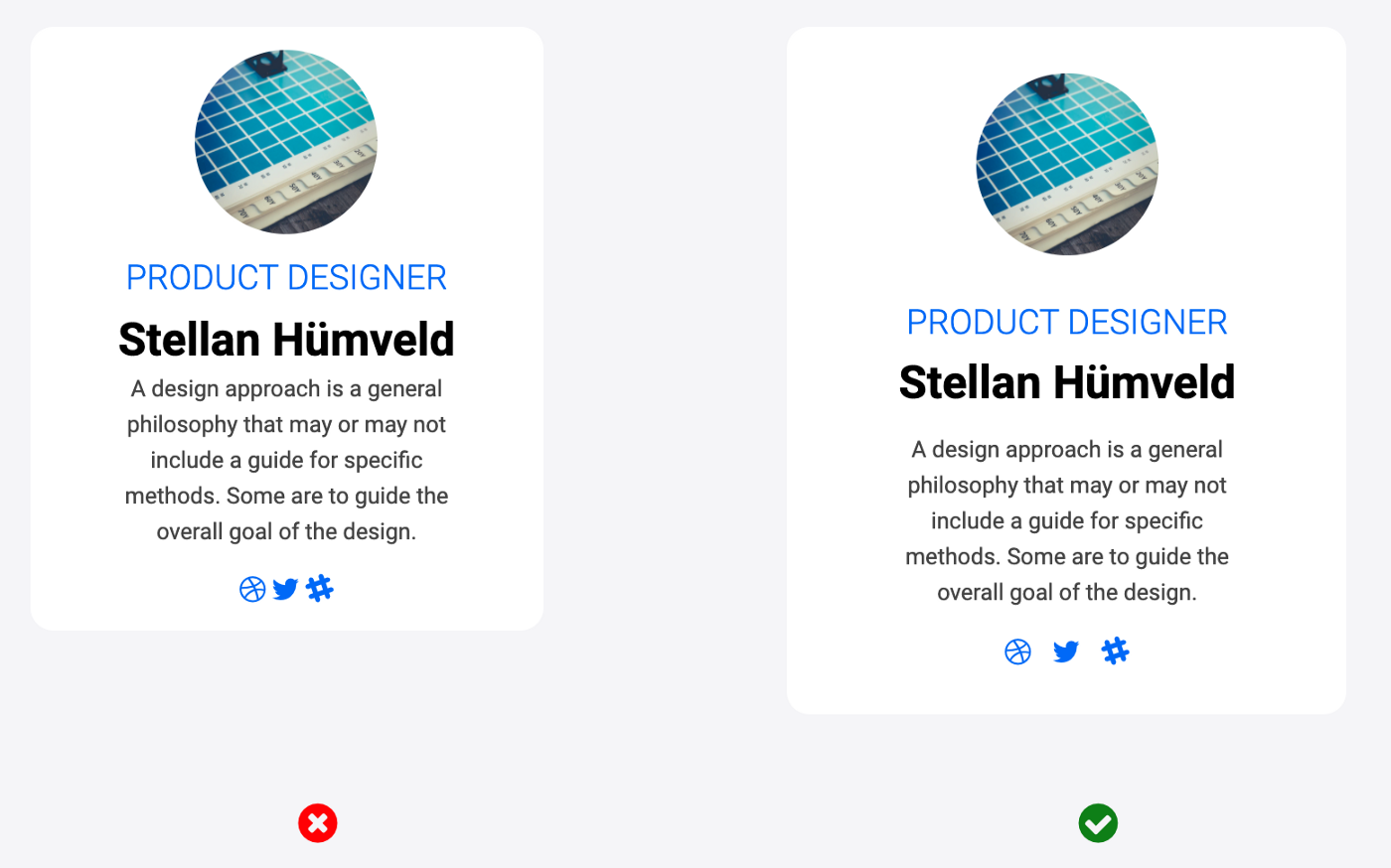
2) Remember to use them between your items.

3) Don't use too much margin to keep your card organized.
You may have floating items that don't seem to belong together.
Some Highlights of the Code
1) Designers and coders don't have the same spacing issues.
It's not you, it's me.
When I coded the (wrong) examples on the left, I had to replace the User Agent Style Sheet (the “default” style for selectors) of h1, h2, h2, h3, p... because they all had default margins that gave me too much space. I used the CSS properties of Margin And of Line Height To fix this problem:
html {
  line-height: 1.6;
}

h1, h2, h3, h4, h5 {
  line-height: 1.2;
}

.card-content h2 {
  margin: 0.4em;
}

.card-content h1 {
  margin: 0.1em;
}
In fact, for the last example where on the right there is too much space, I simply left the default style of the elements.
When designers have a problem with “too little space”, I actually had too much space as a coder!
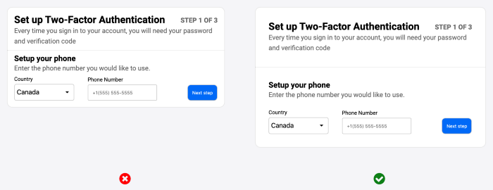
2) Is it a love letter to Flexblox?
I am just starting to learn grids and I am not yet comfortable with them, so for card design I naturally used a lot of flexboxes. I thought it was great to be able to quickly change the display to get spacing between my items.
To give you a taste, I'm going to explain the concrete details at the bottom of the map in my second example:

The corresponding HTML:
<div class="card-form">
 <div class="card-form-group">
   <label for="country">Country</label>
   <select id="country" name="country" class="custom-select">
     <option value="canada">Canada</option>
     <option value="australia">Australia</option>
     <option value="usa">USA</option>
   </select>
   </div>
   <div class="card-form-group">
     <label for="fname">Phone Number</label>
     <input type="text" id="fphonenumber" name="phonenumber" placeholder="+1(555) 555-5555">
   </div>
   <button type="submit">Next step</button>
 </div>
</div>
It has a global div, Cardform Which contains three elements: two divs card-form-group And the Button Submit.
.card-form {
  display: flex;
  align-items: flex-end;
  flex-wrap: wrap;
  align-content: space-around;
}

.card-form .card-form-group {
  margin-right: 2em;
}

.card-form button {
  margin-left: auto;
}
In the declaration block for .card-form: with the display: flex; I place the elements inside the div in a row, I don't need to specify justify-content: flex-start; because it's the default. The line align-items: flex-end; Place all items at the bottom of the div, so that the inputs and the button are well aligned. The Last Two Lines flex-wrap: wrap; And align-content: space-around; Are there for responsiveness, if the width of the div gets too small, the elements will go to the next line.
I needed some space between the first two entries so I added margin-right: 2nd; For these.
Then Finally to Get the Button on the Right I Had to Add margin-left: auto; Which will automatically “push” the button to the far right.
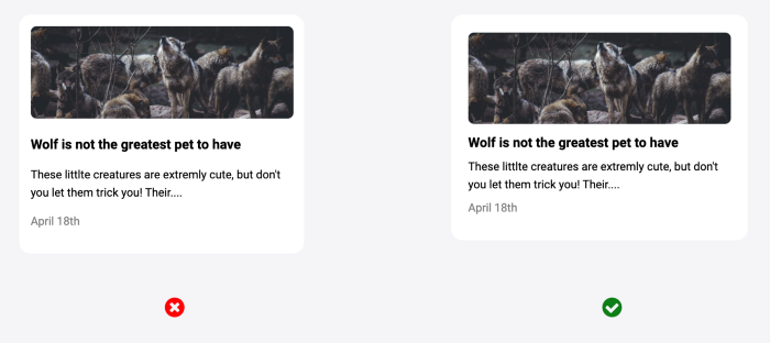
But you don't need to flexbox all the time. For “stacked” items like the following cards in the third example, I used display: block; Of the div defined by the user agent style sheet, so that they are put naturally one after the other, as you can see with your browser's inspector:

There was a moment when I had a doubt about my use of flexbox, for the design of this card:

The HTML looks like this:
<div class='card card-white'>
  <div class='card-content'>
    <img src='https://images.unsplash.com/photo-1550340499-a6c60fc8287c?ixlib=rb-1.2.1&ixid=eyJhcHBfaWQiOjEyMDd9&auto=format&fit=crop&w=1950&q=80' alt='paris-landscape'>
    <div class=card-details>
      <h3>Paris</h3>
      <p>From £200</p>
      <div class="stars">
        <i class="fa fa-lg fa-star"></i>
        <i class="fa fa-lg fa-star"></i>
        <i class="fa fa-lg fa-star"></i>
        <i class="fa fa-lg fa-star"></i>
        <i class="fa fa-lg fa-star"></i>
      </div>
    </div>
  </div>
</div>
There is a display: flex; We .card-content And in order to get some space between the Img And card-details I Had to Add a Bit Margin-left In card-details.
I Then Remembered The media object Which was invented by Nicole Sullivan in this article and this card is one. She writes it using the Floater.
TL; DR on the flexbox : don't put it everywhere.
That is all! If you liked how I detailed some of my use of flexbox and want other parts of the code explained, let me know in the comments and I'll be happy to add them! :)
Resources
Design resources from which I drew my examples:
- UXdesign: 9 tips to quickly improve your UI designs
- Refactoring UI: Adam Wathan and Steve Schoger (preview)
- The Startup: 5 Design Tips to Help Create Effective User Interface Designs
- uxDesign: A checklist to improve your product UI
Resource code: