Related articles


Modernize your short forms

Modernize your short formsSometimes you are faced with a very basic form, such as a login page, and you don't know how to make it look nice. You can try to center it, align it left or right, but the page always looks the same: empty! If you are facing this particular situation, this article is for you.Indeed, there are many ways to get a good result, otherwise the Internet would be much less fun. This article shows you a way to easily decorate a page containing only a small form, such as a login or registration page.
The theory
1. A simple problem: emptiness
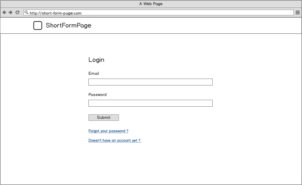
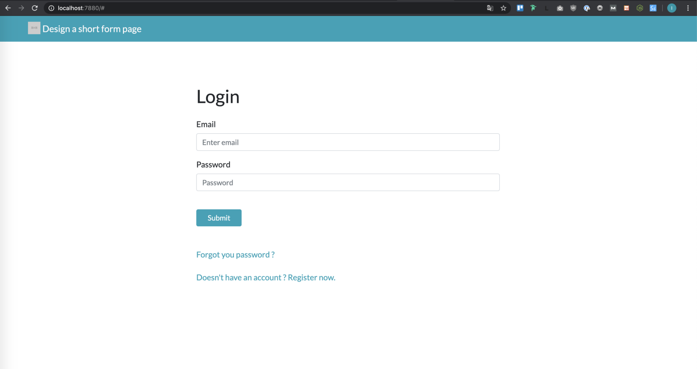
Once upon a time there was an example of a page containing a very simple form. Here is a login page, very basic: only a title, 2 text fields, 1 submit and 2 links. Does the page look good but doesn't look finished? The problem is that it is very empty.
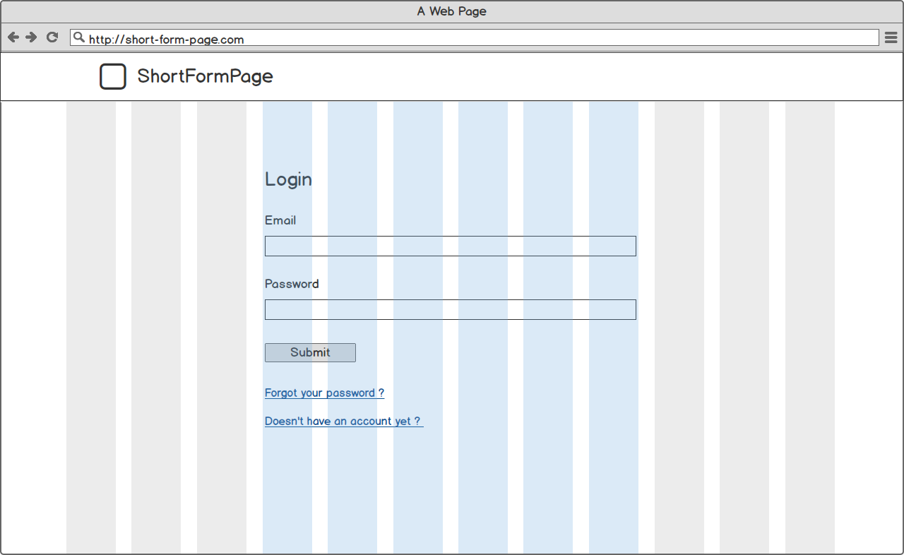
If we add up Bootstrap's classic 12-column grid, we can see that this design is a 3 -6 -3. 6 columns in the center surrounded by 3 columns on each side. If we take a closer look, we can see that we are only using 6 columns (in blue). That means we have 3 + 3 = 6 unused columns. 6 out of 12; we're only using 50% of the available space! This is the culprit for our lack of form.
Let's find a solution (among many others) to fix this easily.
2. A simple solution: add an image
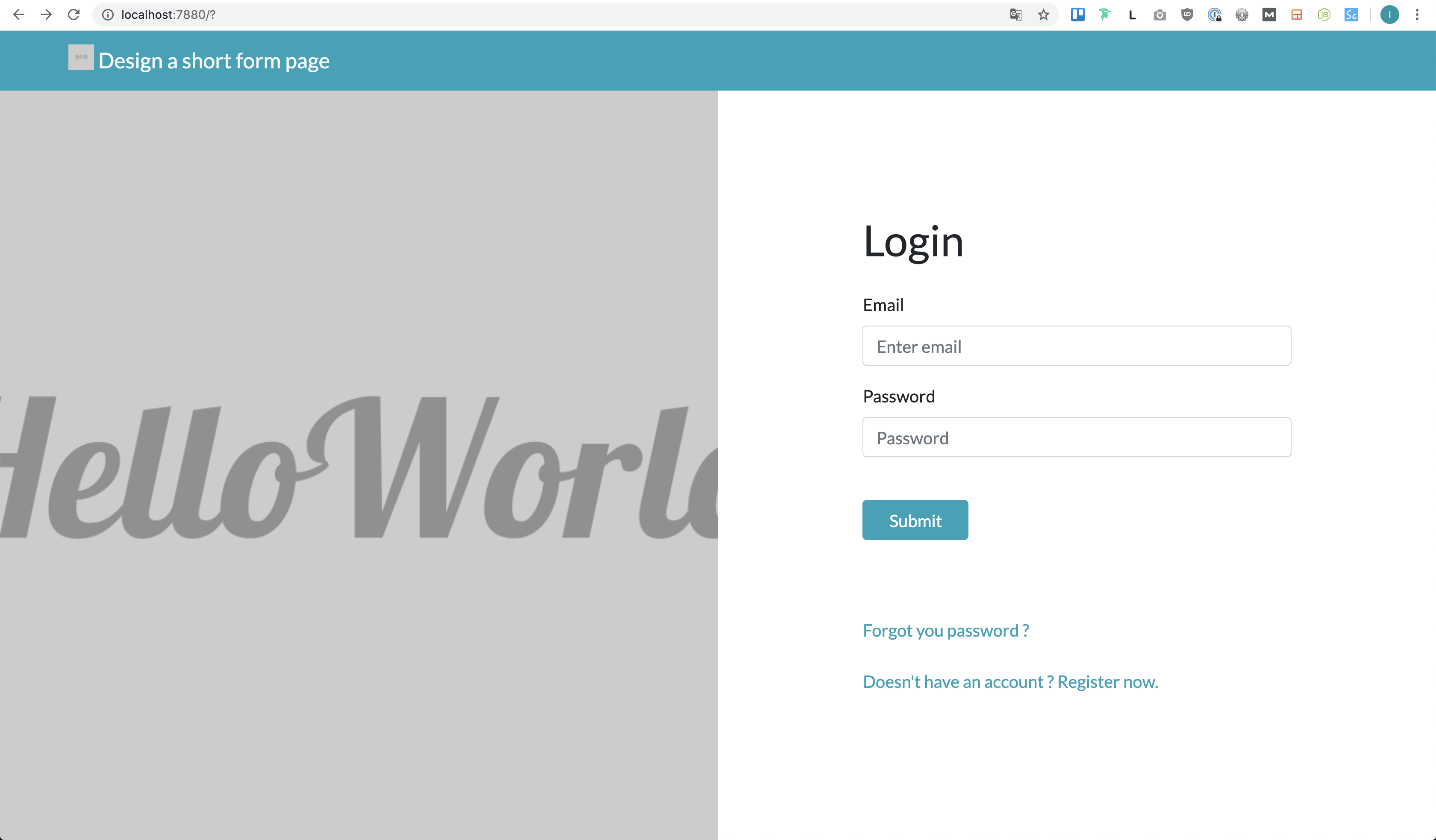
The solution is quite simple but it allows you to refresh the style of the page, isn't it? Let's take a look at this design on a grid.
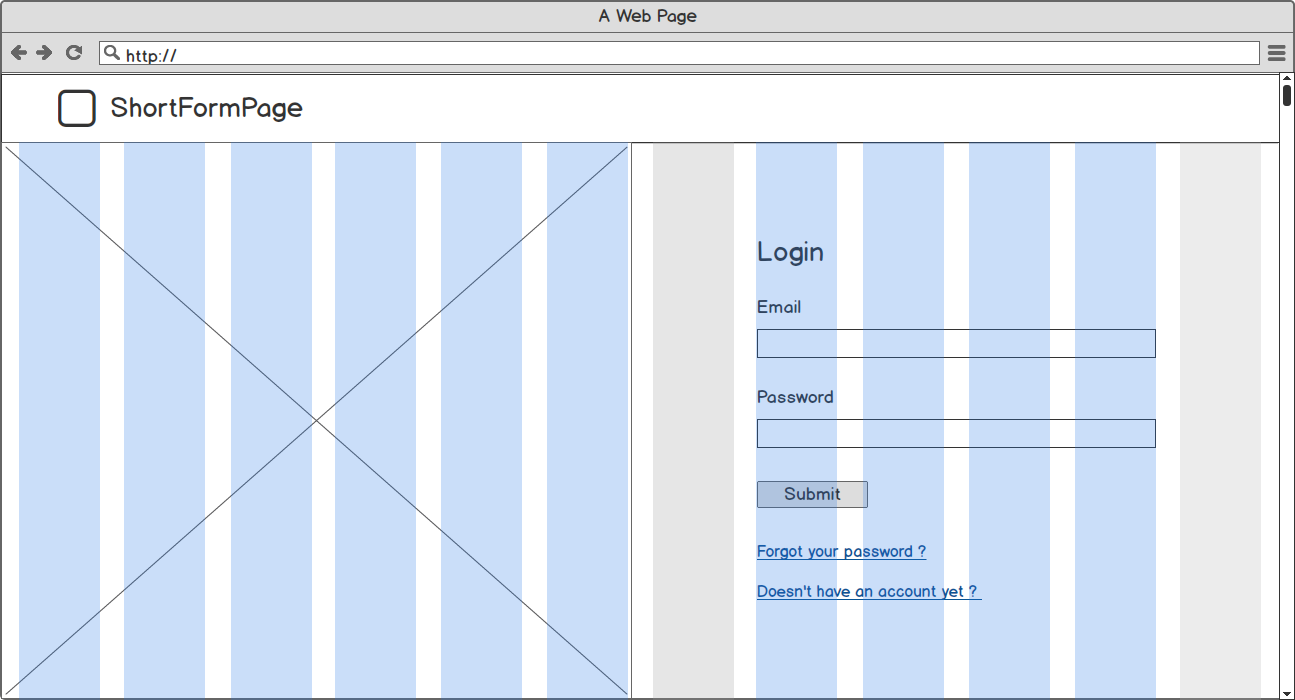
With the grid shown, we can see that the content is now taking up a large portion of the screen. 10 out of 12 columns used. As I promised you: very simple, very fast.
The practical part
Now let's focus on the practical part: how to implement it and how to choose the right image that will make it wonderful:)
Implement a “screenproof” left side image
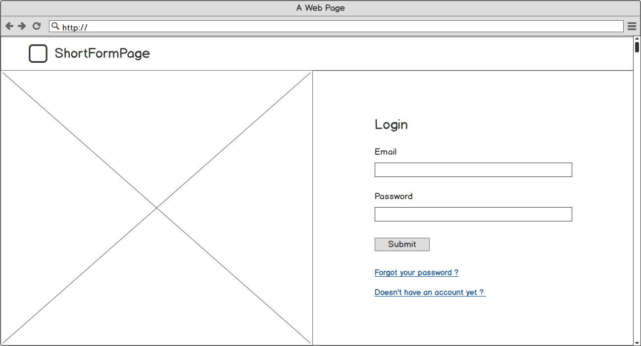
If we look at our wireframe again, we know that we need to split our screen into two parts; the left part for our image, the right part for our form.
As far as the image is concerned, I would prefer to use a css-background rather than a tag. <img /> Why? Because depending on the size of our screen, the image ratio will not be the same. Using a css background will allow us to avoid using a tag <picture>(another article is coming soon on this great tag) and to keep our image ratio.
To implement this method, I simply divided my form into two 6-column parts for large screens that will cover the full width of the page on smaller devices. I gave the left side a height of 100vh (viewport height) and a css background. The right side is only display-flex and margin-auto to make sure it's centered. For smaller screens, the height on the left side increases to 15rem (~ 300px for my configuration). That is all!
I used the front-end development framework Bootstrap 4 to make this page, but it could easily be done without him.
Choosing the right image
Finally, we need to choose an image for the left side. As the screen size is going to decrease, the width on the left side is also going to decrease and we need to find a way to manage that.
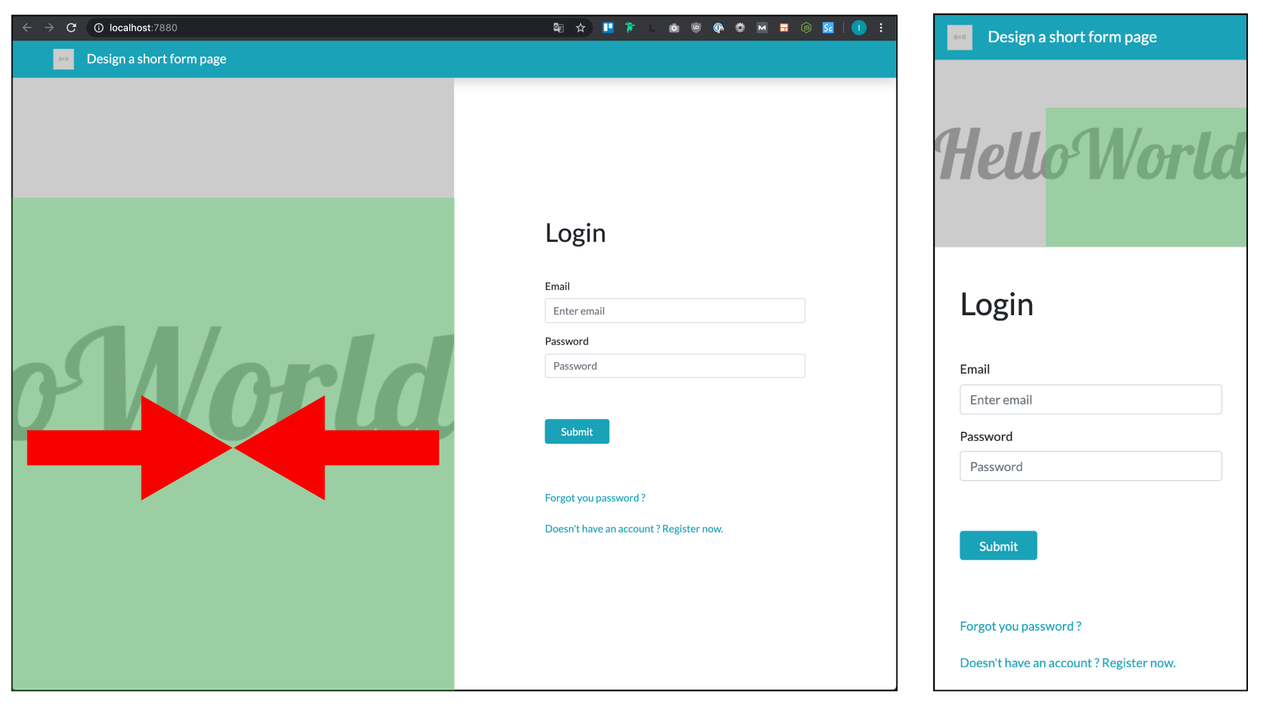
As we can see, our image must be in landscape format to adapt to the needs of the mobile screen. On the left side, the red arrows highlight the fact that the width of the left part of our image will decrease as the screen size decreases. The background position in css is set to the center for the Y axis and to the right for the X axis. This means that if the image doesn't fit in its container, it will overflow to the left and top.
The green squares highlight the area of the image that will always be visible regardless of screen size.

In fact, we need a landscape image that remains “whole” even though we can only see the area highlighted in green. That's where the rub is. To find images, I often use Unsplash, a library of freely usable images.
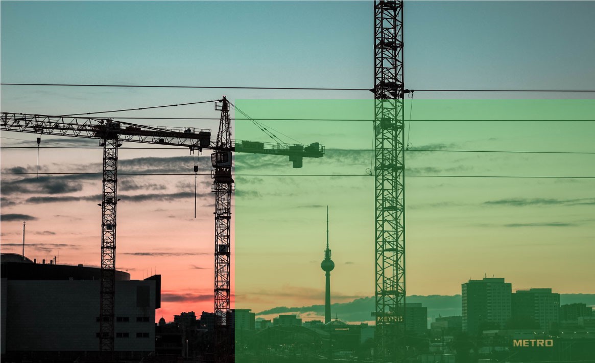
This random image seems perfect for what we need: usable in its entirety and with a standalone bottom right corner.
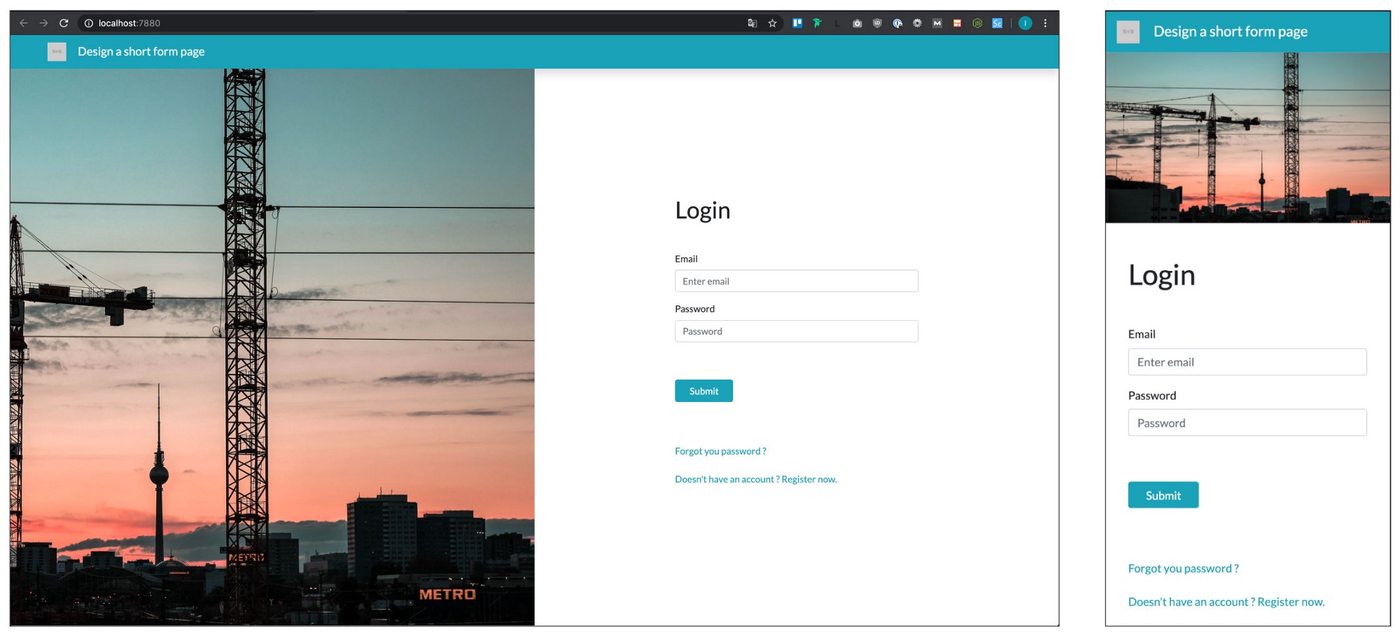
And that's it! We have now redesigned our form to make it look modern and clean. It's a very, very simple way to refresh a page with a very short form.. I'm not saying it's the best way, there are lots of other options to do it (Ping Codepen) but it's a good way if you don't have a lot of resources to devote to designing your page.
The page now includes a very large image, you might want to take a look at This article which gives you tips for optimizing your image for the web.